Brand Style Guide
Mission
Our mission is to help business owners and operators grow their businesses into sustainable and profitable organizations through the use of technology.
Personality
Energetic
Energy drives everything. We approach everything eager to help and with positive energy. Since our clients are fast-paced environments, we must do everything with a sense of urgency.
Curious
We are eager to learn. It could be about our client, operations in general, or regarding technical solutions. Our team wants to know the ins and outs of everything.
Forward Looking
What’s next? How can we help, build upon, or create something that will solve our client's challenges.
Approachable
We are your geeky cousin or best friend. You aren’t afraid to ask questions, and we are always here with answers.
Promise
Our promise is to give restaurant operators anything and everything they need to thrive and be right by their side when they need help.
The Brand
Name Origin
Focus was built around the idea of building technology tools for restaurant and bar owners/operations that would allow them to “focus” on their business, not the technology.
Name Usage
While our business name is Focus POS of Arizona, LLC and we do business as Focus POS California, we have simplified our name and branding down to Focus for all communications for simplicity’s sake and to keep consistent branding across markets.
Primary Logo
Blue cloud with orange lettering spelling out the name “Focus” starting on top of the cloud and going to the right.

Secondary Logo
Blue cloud with orange “F” in the center.

Color Palette
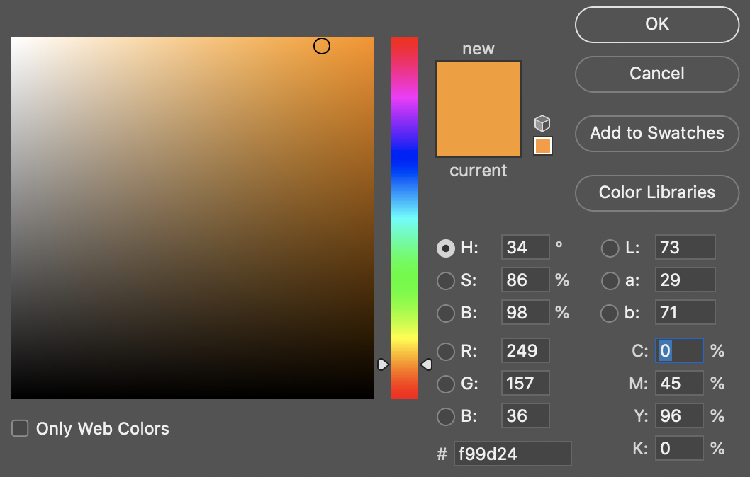
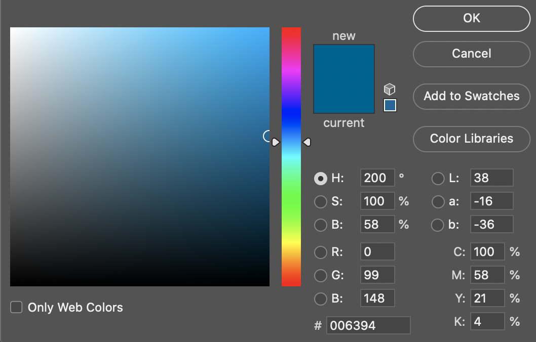
The lettering in the Focus logo should be white (#ffffff) or orange (#f99d24). The cloud should be white (#ffffff) or blue (#006394).


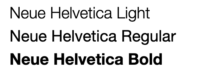
Preferred Typeset

Application Colors
Throughout Focus POS and the FocusCloud Suite (Online, On, CommandCenter, Kitchen etc). Certain colors are used consistently:
- Primary:

- Blue
- RGB 22,144,237
- #168fed
- Foreground Text
- White
- Primary function/action button.
- Should never be used en masse in a UI
- Secondary:
- Blue/Gray

- RGB 86,112, 125
- #56707d
- Foreground Text
- White
- Used predominately for navigation or other secondary functions.
- Should never be used as the primary call to function button style.
- Suggested as the button color when displaying an array of similar buttons.
- Danger
- Red

- RGB 207,29,47
- #cf1d2f
- Foreground Text
- White
- Used to indicate an alternative choice when paired with the Primary.
- Do not use en masse in a UI
- Warning
- Yellow

- RGB 250,184,17
- #fab811
- Foreground Text
- Black
- May be used as a tertiary function.
- Should be used sparingly in a UI and typically paired with a less fatal option (which would be rendered in Danger.
Application Iconography
The FocusCloud suite uses many different icons to denote and differentiate functions. These icons are sourced from FontAwesome (https://fontawesome.com).
All Guest Facing iconography uses the "Regular" or "Duotone" Font Awesome collections.
All administrative functions (i.e. CommandCenter) uses "Regular" exclusively.
Font Awesome "Brands" are used to render brand-specific logos including credit card payment types where applicable.
Web Presence
Company Website
https://focusca.com
Facebook
https://www.facebook.com/FocusPOSCA
Instagram
https://www.instagram.com/focusposca/
LinkedIn
https://www.linkedin.com/company/focus-pos-california
Twitter
https://twitter.com/focusposca

Comments
0 comments
Please sign in to leave a comment.